3 keys content creators need to know about before creating their logo
TAKE OWNERSHIP
In 2016, I knew nothing. All I had was YouTube and a desire to watch, learn, and apply what I learned to creating my first blog. Creators who want to grow will seek knowledge and use it. Today, I want to share three key points to consider when designing your brand logo.
The Navy taught me about ownership. As a young Sailor on the USS Carl Vinson, painting became a way of preserving the ship’s life. Lucky for me, I had some experience painting before enlisting. RED was the color of the WEAPONS DEPARTMENT spaces onboard.
Colors were also used in our at-sea uniforms to distinguish our roles. RED designated those belonging to Weapons. Most spaces on the ship with heavily applied RED paint may identify that department’s spaces—ownership through color.

LOGO COLORS
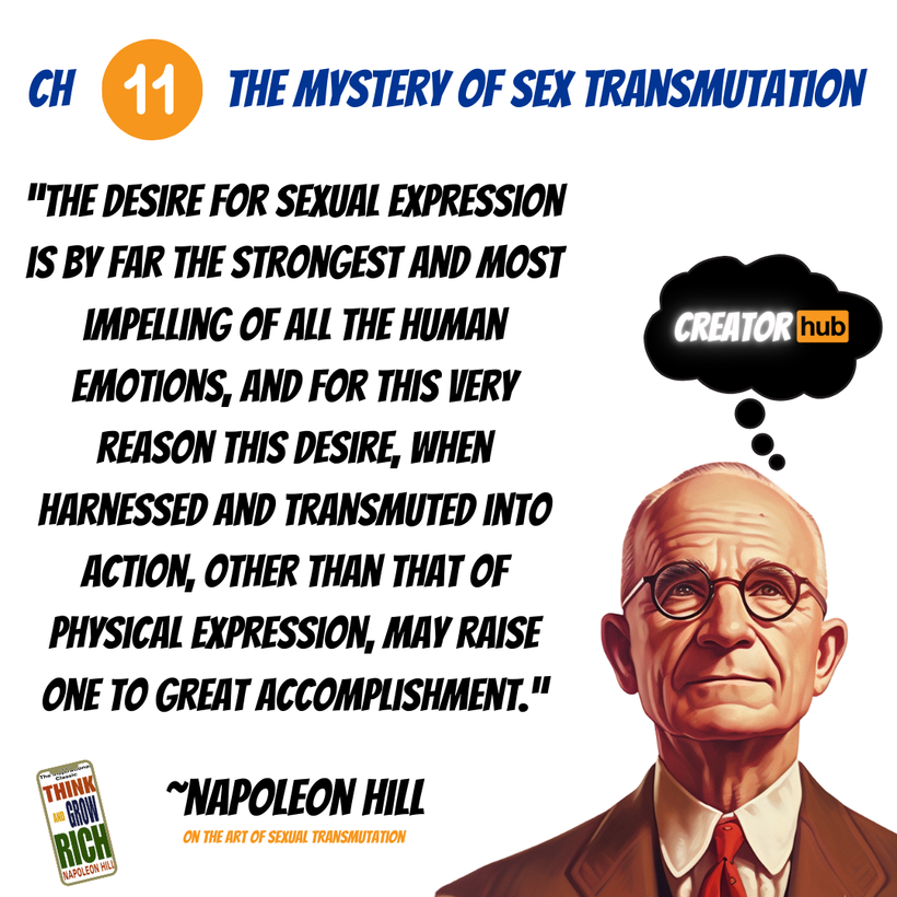
You might have noticed the color orange in my Creator HUB logo. It’s actually a spin-off of Napoleon Hill’s Think and Grow Rich, specifically Chapter 11, “The Mystery of Sex Transmutation.” Most adults are familiar with the orange in the PORN HUB logo.
Colors play an essential role in your logo. You must put thought into this process becuase there is psychology behind colors in marketing. I go into detail in my eBook, The Art and Science Behind Your Brand Logo, available on Amazon.
In marketing, the color orange conveys enthusiasm, creativity, and friendliness, making it ideal for brands that want to appear bold and energetic. Well played, Porn Hub. Do you see the importance of colors in logos and branding now? Get your mind out of the gutter.

3 LOGO TYPE KEYS
WORDMARK – A wordmark is a logo design consisting solely of the company’s name written in a unique font and style, such as those for Google, FedEx, and Disney.
LETTERMARK – A lettermark is a typography-based logo that uses a company’s initials, also known as a monogram. It is a stylized abbreviation of a brand name and is often used for companies with long or complex names to create a simple, memorable, and versatile symbol. Famous examples include IBM, CNN, HBO, HP, and OAT (Official America’s Team).
TRADEMARK – A trademark is a word, phrase, symbol, design, or a combination that identifies and distinguishes the source of goods or services of one party from those of others.

Logo Conclusion
Life is full of colorful symbols we call brands, such as the Dallas Cowboys Star. Everybody knows what that Star stands for and means. This is why I love Jerry Jones. His ability to pioneer that logo into a $13B sports franchise is proof it can be done with a symbol.
From OAT to BDG, my experience with colors and symbols in CANVA has enabled me to create at a higher level compared to other creators in our fan base. Take it from a veteran, literally. From the ranks of service to ranking on Google, I have earned my stripes.

Every Saturday, I like to share free games with other content creators here on social media. If this is your first time and you found some value here today, download the Patron APP and join my Creator HUB here FREE today. The app will provide you with the best experience here.
Understanding the psychology of color and marketing can help you create the logos or watermarks for your three brand types. Need help getting your logo started today? I can help with that. Leave a comment below, please.
See you next week when I share why personal development is crucial for content creators.
Share this:

Discover more from OAT
Subscribe to get the latest posts sent to your email.

